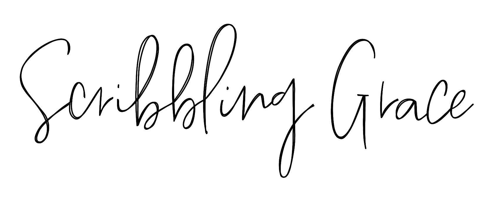
If you are just getting into calligraphy/ hand lettering the best place to start is by learning a simple script letterform in faux Calligraphy. It takes some practice, but soon enough you’ll have it down. And it only takes three steps, a normal pen, and paper to get started!

First, create your letterform
The first step is to write your letter or a full word in cursive. As your write pay attention to the direction your line is going. This may be up, down, or across.
That’s all for the first step! See, you totally got this!

Next, add a downstroke
Now, this step is a big one and gets a bit trickier.
First, you need to know the three types of strokes in calligraphy:
-The upstroke- the thin line that you use when you pull your pen upward
-The downstroke- the thick line created when your pen falls downward
-The midstroke- when your line is horizontal (like the crossbar in an “H” or “T”)
In calligraphy, your main focus is on the downstroke. In dip-pen (the original form of calligraphy) or brush pen calligraphy, this downstroke is created using pressure while you are drawing your letter. But for what we are doing today, faux calligraphy, we are going to create this thicker line by manually adding it in after we draw our letter.

So, since you already wrote your letter out, you already have the upstroke and midstroke done! All you need to add is the down stroke! Remember when I said to pay attention to the direction that your line was going? Look at your letter (or redraw it if you need to) and at those points where your line was falling downward, add a second line parallel to it.
The farther this new line is from the original line, the fatter your downstroke will be, and the closer this second line is, the skinnier this downstroke will be. It also does not matter which side you put the new line on, just try to add it where you have more space or where it makes sense to you.
If you have a hard time finding your downstrokes, I included a free printable at the bottom of this post (or click here) that you can use to create your letters! As well as a video showing this for you visual learners!
And you’re done with this second step!
Last but not least, fill it in!
Now, all that’s left to do is fill in the space between the two downstroke lines! That”s all! You just created a faux calligraphy letter! Keep doing steps 2 and 3 until your word is finished. There you go! You made some pretty script lettering!

CLICK HERE TO GET A FREE PRINTABLE FAUX CALLIGRAPHY ALPHABET WORKSHEET
